
Bangkok Thai: Brand Identity System



Overview
Self-Initiated Rebrand Concept
Role
Brand Designer
Scope
Logo Design, Brand Identity, Website Layout Design, Color Palette, Merchandise, Social Media Applications
Project Type
A speculative rebrand concept developed for Bangkok Thai & Sushi, a local restaurant. This self-initiated project explored what a modernized identity could look like for a restaurant with so much cultural richness and craft behind its food.
Bangkok Thai & Sushi is a local restaurant blending the flavors of Thailand with the artistry of Japanese cuisine. This self-initiated project explored what a modernized brand identity could look like for a restaurant with so much cultural richness and craft behind its food (pictured, current branding).

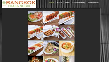
BEFORE
The Problem: Bangkok Thai's homepage includes a photo carousel with no text alternative, so there's no way to browse dishes without scrolling through images one at a time. Low-contrast labels make navigation hard to follow, and there's no clear call-to-action (CTA) from browsing to ordering.


The Approach:
Brand Identity: A logo mark built from Naga symbolism, paired with a warm gold-and-green palette and typography that reads as upscale without losing warmth.
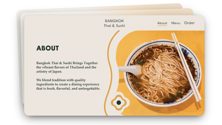
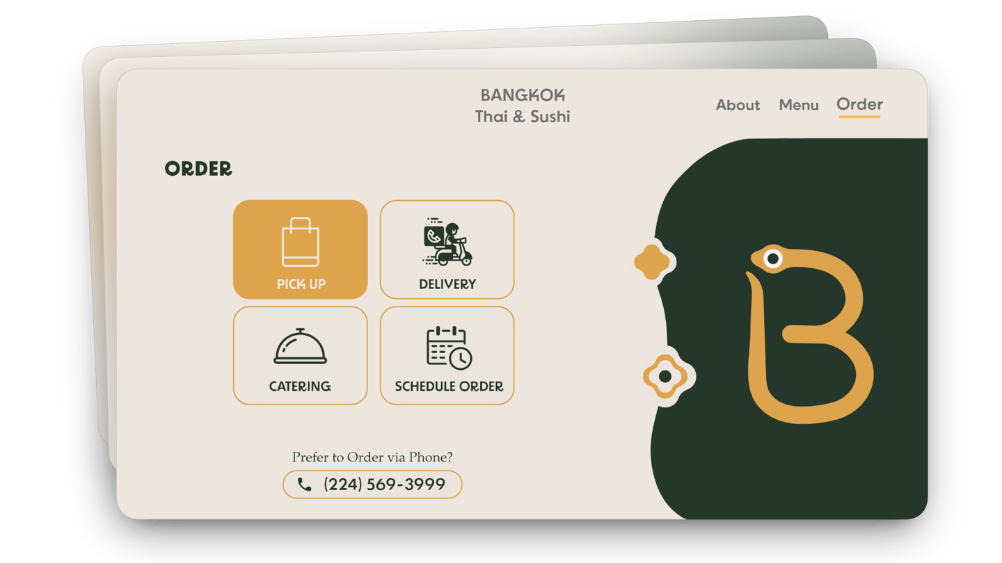
Web Design: A menu structured as clear category navigation instead of a photo carousel, with pricing and CTAs legible at a glance.
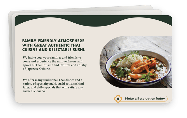

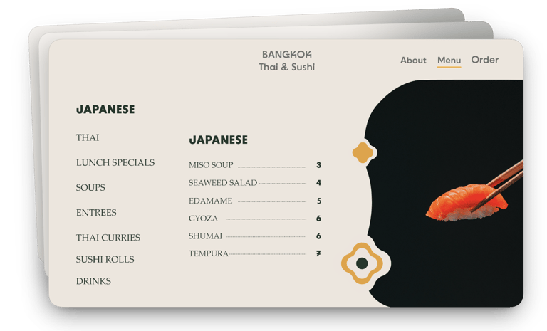


The Result: A brand system built to hold up across signage, packaging, and digital touchpoints.
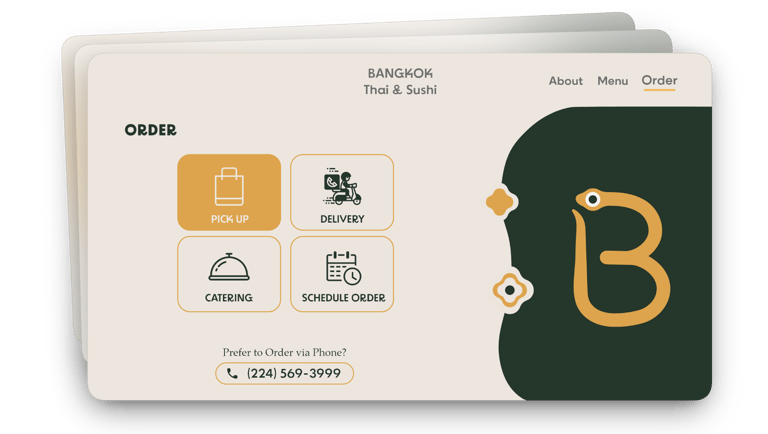
The ordering flow replaces the old photo carousel with category navigation, a persistent cart, and a three-step checkout, designed to get someone from browsing to order in as few steps as possible.
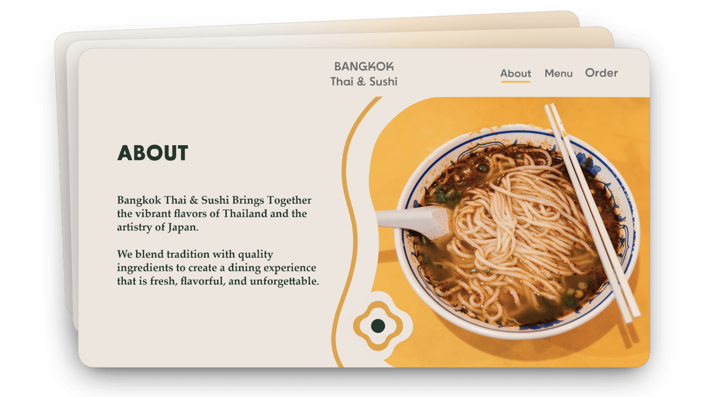
Note: This is a speculative concept project. Bangkok Thai is an existing local business and this rebrand was not commissioned by them.
Contact
contact@karolina-gostomski.com
© 2026. All rights reserved.