
Interactive Infographic










Overview
Self-Initiated UX/UI and Design Project
Role
UX/UI and Visual Designer
Scope
End-to-end design including concept development, custom illustration, information architecture, interactive prototyping, and visual design system
Project Type
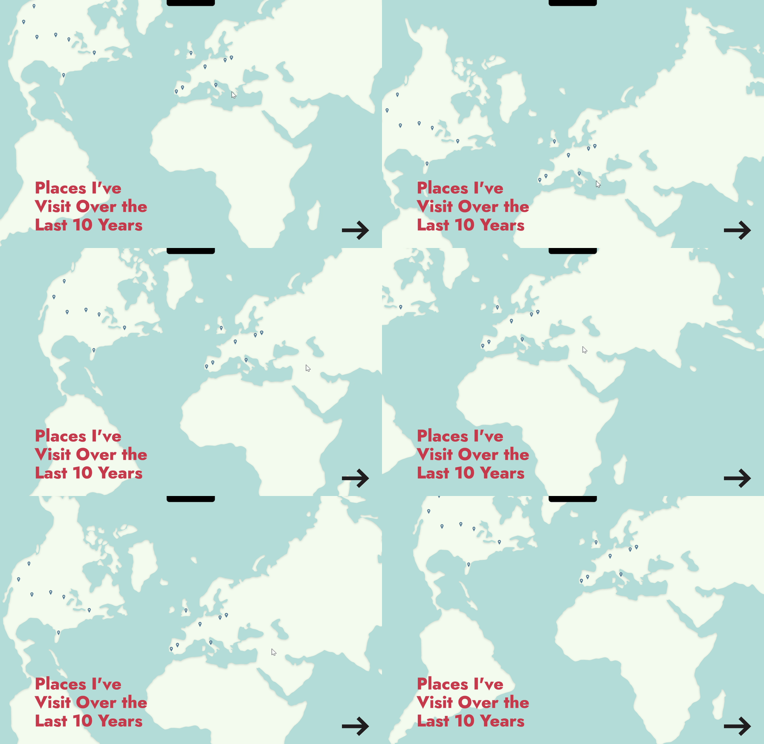
A dashboard blending personal travel data with narrative storytelling through custom illustrations and UX-focused interaction. Designed to transform raw data into an emotionally resonant, exploratory digital experience.
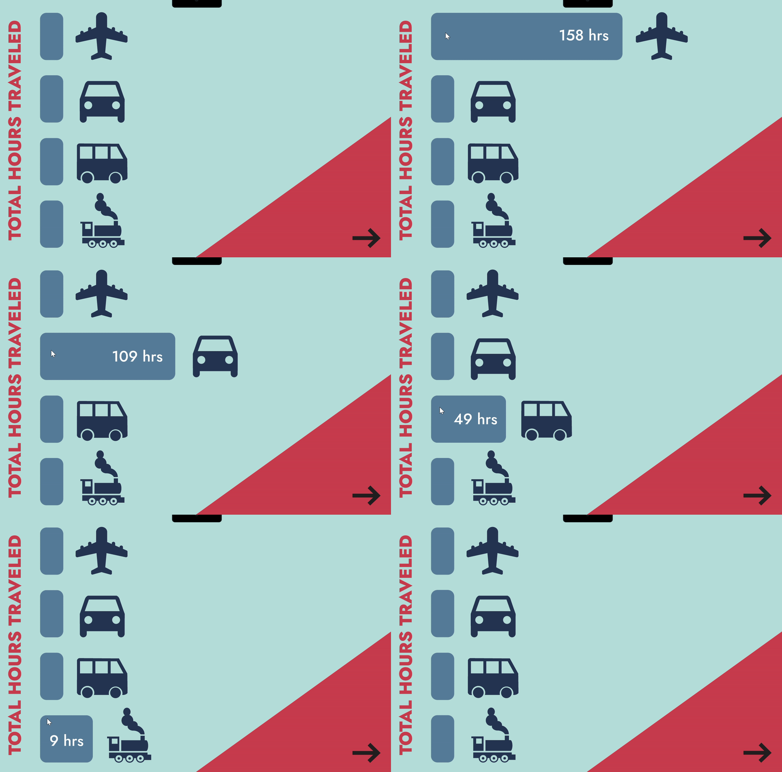
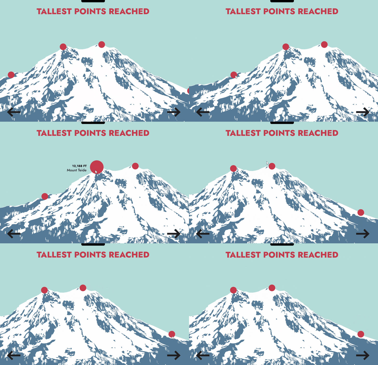
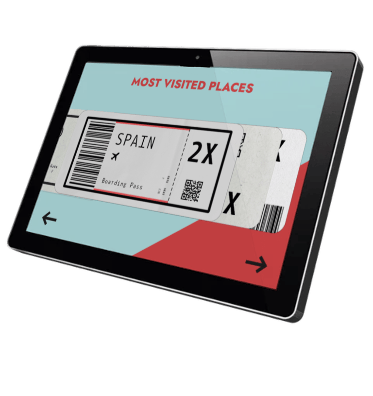
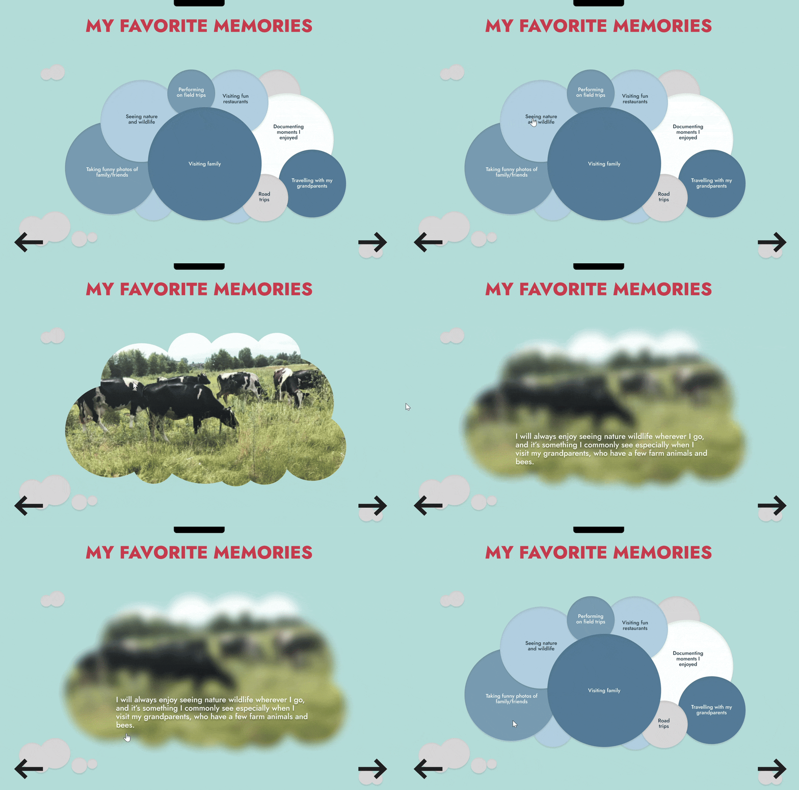
This project started with a simple question: what does my travel history actually look like as data? I compiled personal travel experiences into a range of metrics — some concrete (altitude highs reached, transportation modes ranked by frequency), some subjective (favorite memories scaled by personal significance) — and designed a system to make that data feel worth exploring.
The central design challenge was making subjective and objective data coexist without feeling inconsistent. Concrete stats needed clarity; memory-based data needed a different visual logic that could communicate weight and meaning rather than just quantity.
The navigational structure was intentional. I wanted the experience of moving through the dashboard to mirror the experience of traveling itself. Rather than a static read, it becomes something you move through, which shaped decisions around layout, interactive states, and the custom illustrated UI elements built in Figma.
The result is a fully interactive prototype that shows range across data visualization, UX thinking, illustration, and interaction design in one cohesive project.


Contact
contact@karolina-gostomski.com
© 2026. All rights reserved.